Improving UX for Insurance Platforms
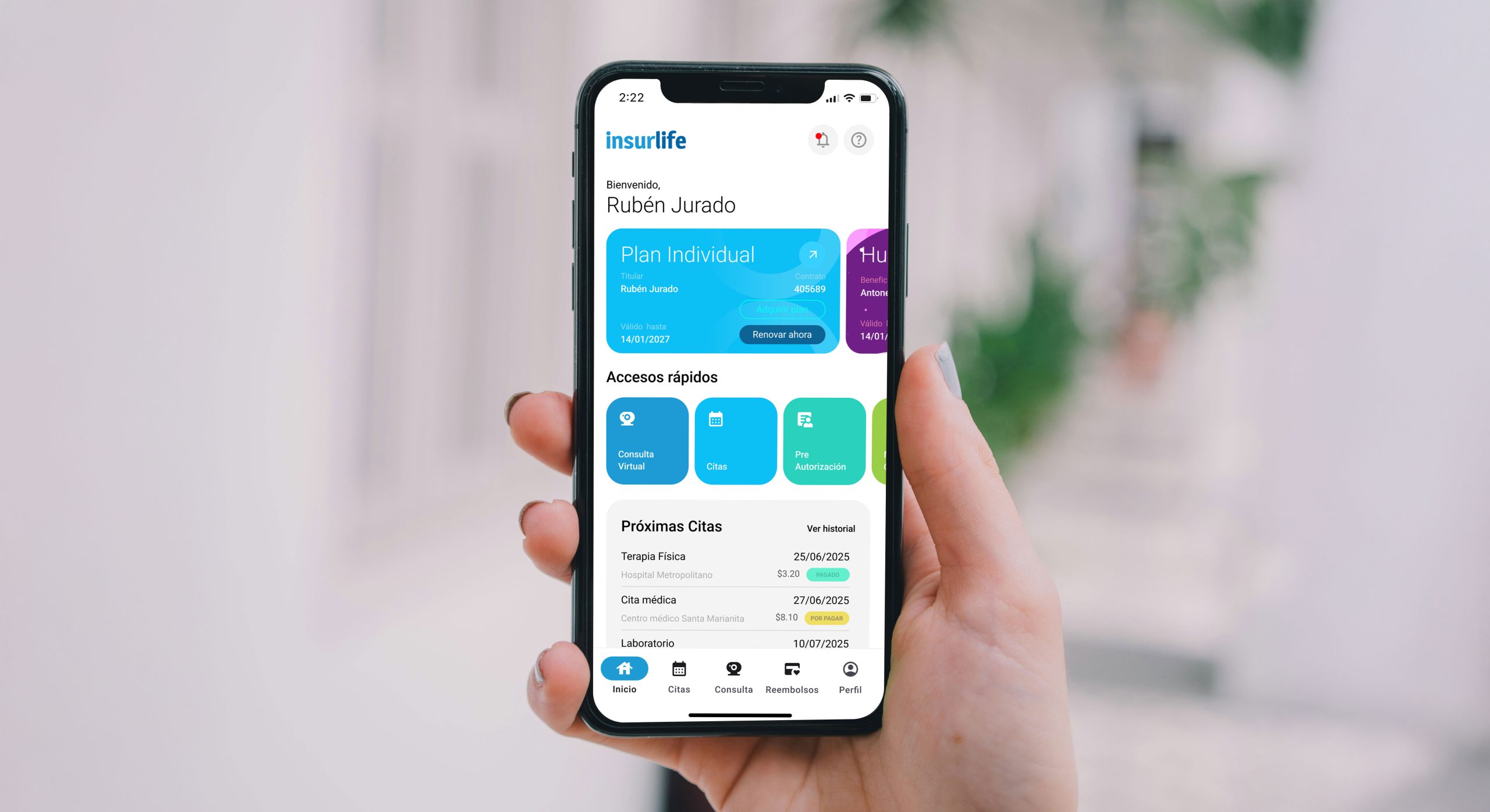
Redesigned the mobile app and corporate portal of an insurance provider to improve usability and service access. Focused on simplifying key user actions and enhancing information architecture. Introduced a centralized B2B management system and a modern UI. Key learning: trust and literacy are critical in insurance UX.
Task
Led the conceptual and prototype design of the mobile app and corporate portal, shaping them as key solution proposals for submission in a public RFP.
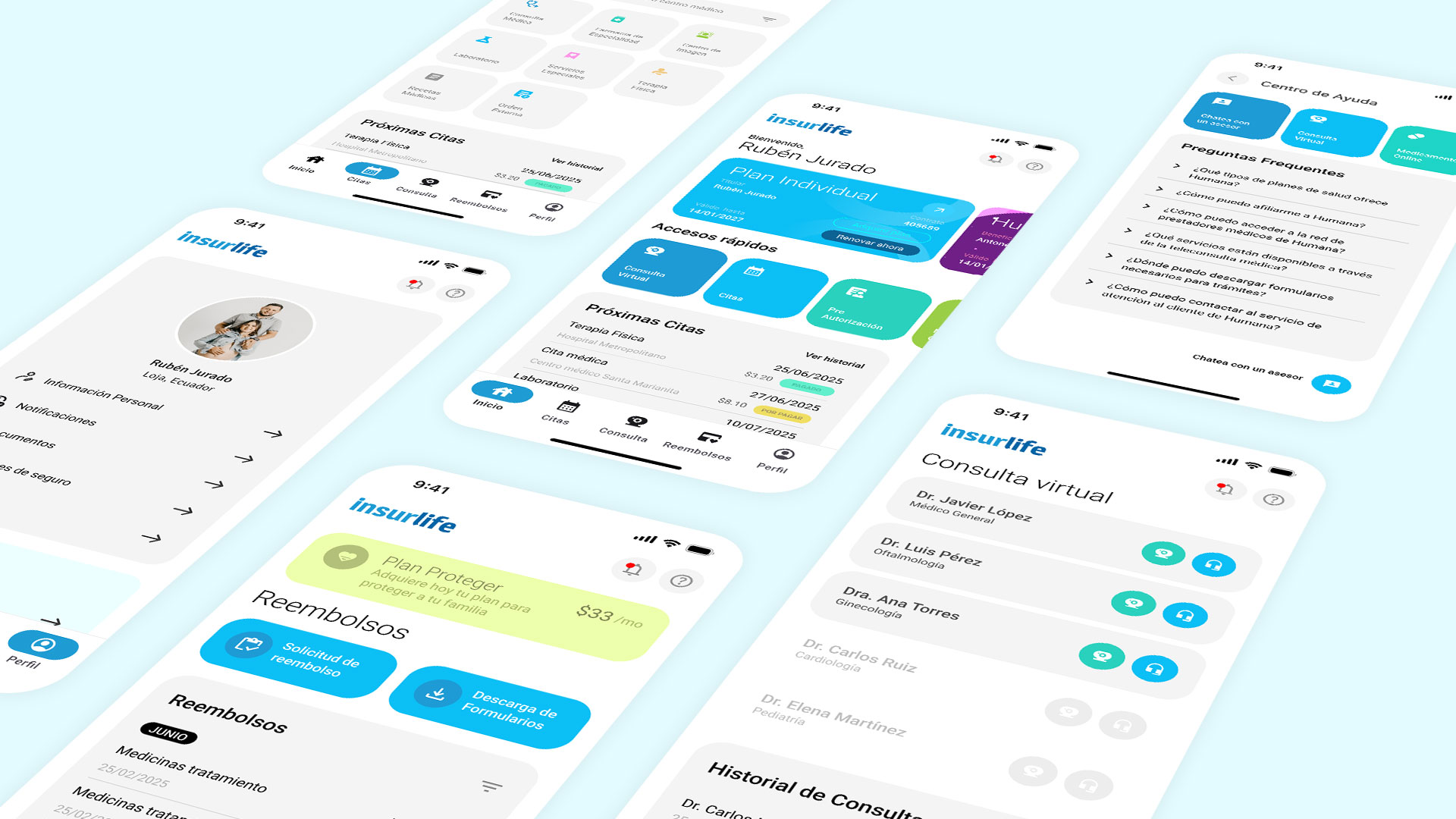
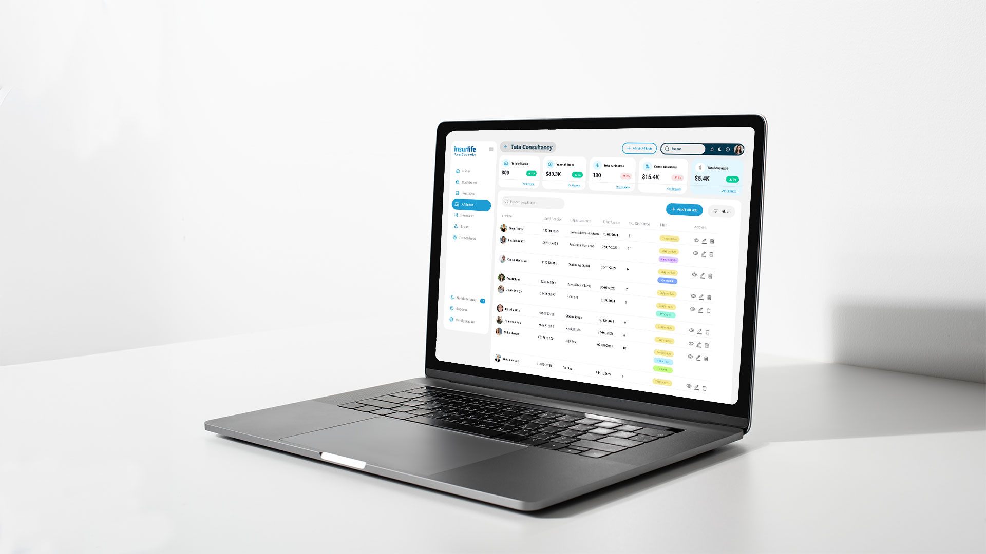
This project originated from an RFP issued by a technology company that brought me on as a Product Designer. The goal was to modernize the core technology and architecture to help their client—an insurance provider—deliver better customer experiences. One of the main challenges was the B2C mobile app, where a fragmented information architecture made it difficult for users to complete key actions such as booking virtual medical appointments, requesting refunds, and managing preauthorizations. Simultaneously, the insurance company needed a digital solution for its B2B clients, enabling them to manage all employee insurance plans in one centralized platform.
To better understand the problem and the business domain, we began with desktop research, analyzing the company’s current benefits, services, and product offerings. We reviewed the existing mobile app experience and identified heuristic issues that could be improved. This was followed by a benchmarking phase, where we studied both local and global competitors. With this foundation—understanding pain points and opportunities—we iteratively worked on a new version of the app. The redesign focused on simplifying access to the three key jobs to be done identified earlier. The proposal features a streamlined information architecture with clear labeling and an optimized search system. Visually, the interface adopts a flat design aesthetic and introduces a refreshed color palette to improve the distinction and recognition of products and services.


Building on the insights gained from our initial research, the core concept of this solution was designed around three pillars: transparency, accessibility, and self-service. The corporate portal operates across three levels of administration—Group, Company, and Employee—allowing business clients to manage their employee insurance plans in real time. Through this structure, companies with insured employees can efficiently oversee affiliations and updates within a single, centralized platform.


A key learning from this project was recognizing the high level of insurance literacy required for customers to choose the right plan. Much like in the banking industry, the insurance sector must invest in building trust and empowering users with clear, accessible information—an essential differentiator in delivering meaningful and confident service experiences.
I’m multidisciplinary designer, scientist and technologist who are excited about unique ideas and help companies to create amazing solutions by crafting business, service and product design.

